
Janssen CarePath
Key Words: Mobile Optimization, Portal Redesign, Design System, Change Management, Healthcare, Cross-functional Collaboration, Sketch, Figma
Janssen CarePath is Johnson & Johnson's patient support platform, connecting patients to benefits investigation, copay assistance, insurance coverage, and treatment coordination for some of J&J's highest-revenue pharmaceutical products. The portal had been built desktop-only from the start. As patients increasingly accessed it from phones and tablets, the experience broke down entirely. The first challenge was making 130+ dense, FDA-regulated desktop screens work on mobile, without losing a single piece of mandatory content. The second, bigger challenge came after was unifying a platform that had grown to support 18+ pharmaceutical brand portals, each with its own fragmented UI, into a single cohesive system.
Janssen CarePath (now J&J withMe),
Johnson & Johnson Pharmaceuticals
Client
2 connected engagements:
- Mobile Optimization
- eVolve full portal redesign
Scope
My Role
UX Designer
Tools
Sketch, Figma
Portal serving 1.16 million+ patients annually across multiple therapeutic areas including immunology and oncology
Scale
Cross-functional team, including product, engineering, accessibility, and compliance, including offshore designer collaboration
Team
Duration
Oct 2020 - Feb 2023
Real Problem (a.k.a. the challenge)
Janssen CarePath had expanded over years to support new products and brand programs without a unified design foundation. By the time I joined, there were two distinct problems:
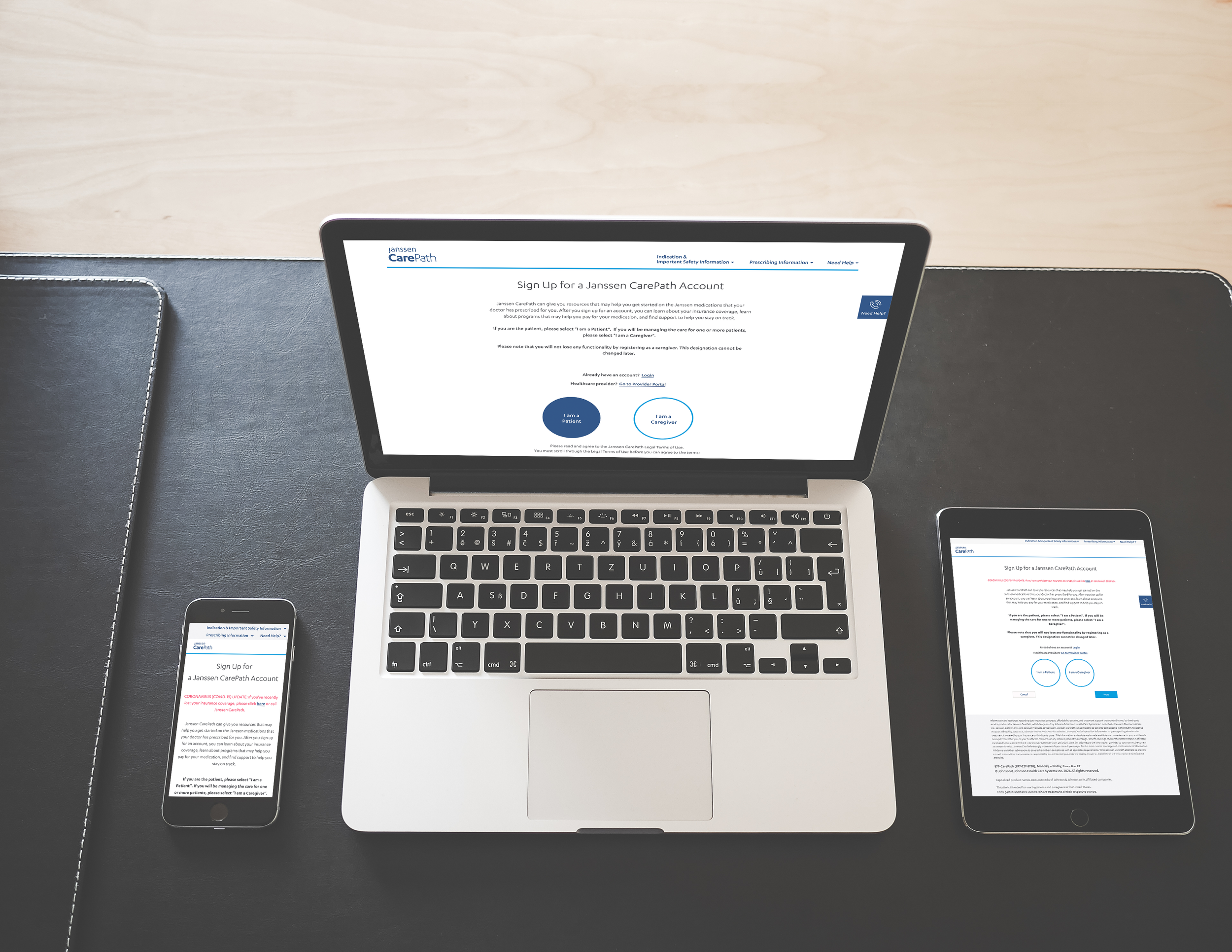
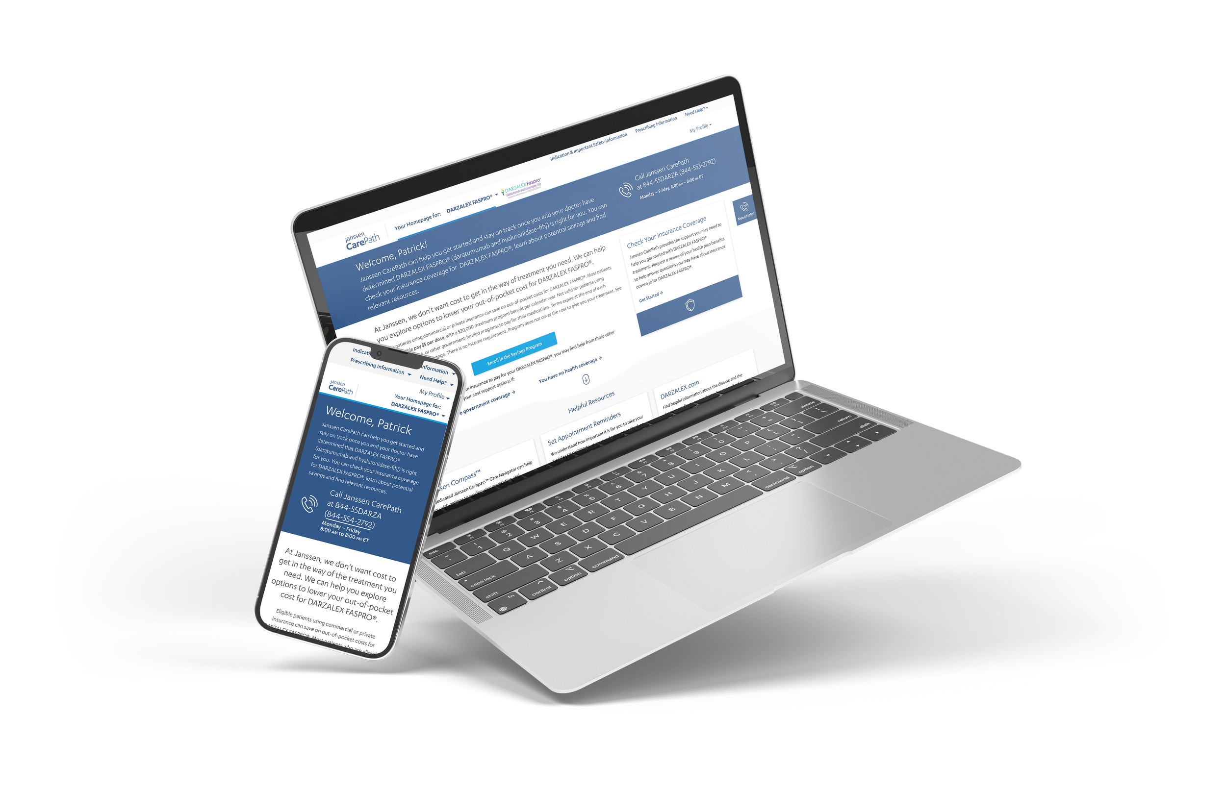
Mobile Optimization: The portal had been designed desktop-only, with dense, text-heavy layouts and no responsive consideration. As patients, who must be going through many managing serious chronic conditions, accessed the platform from phones, fixed layouts made navigation nearly impossible. However, as every piece of content was FDA-regulated, nothing could simply be removed or shortened to fit a smaller screen.
eVolve Portal Redesign: With 18+ brand portals each running independent UI patterns, the same core tasks looked and behaved completely differently depending on which medication a patient was enrolled in. There was no shared component library, no consistent navigation, and no scalable foundation, which implies every new brand or feature required duplicate design and engineering work from scratch.
Regulatory: Due to FDA compliance, any UI change required regulatory review before shipping
Brand: 18+ distinct pharmaceutical brands each had their own visual identity that had to be preserved while moving toward system consistency
Technical: Designs had to integrate with existing legacy pharmacy and EHR systems with minimal structural engineering changes
Scale: 130+ desktop screens needed to be adapted for mobile and tablet (portrait and landscape) across 4 phased releases
Ongoing compliance: Every post-launch change request required a regulatory review cycle before implementation
Constraints
Design Decisions
Rethinking content hierarchy for mobile, not just resizing
Rather than scaling down desktop layouts, I restructured information hierarchy for each screen by identifying the most critical patient action at each step and building progressive disclosure around it. Dense regulatory content was broken into digestible sections without removing anything required. New mobile-specific typography and spacing scales were established as an extension of the existing design system.
Token-based system over brand-specific components
For the eVolve redesign, early options included building separate component sets per brand. The problem was that 18+ brands meant unsustainable maintenance, and every structural change would trigger separate FDA review cycles for each. I advocated for a token-based approach (one underlying component structure with brand-specific theming applied through design tokens) so each brand could maintain its visual identity without requiring structural redesign or re-approval.
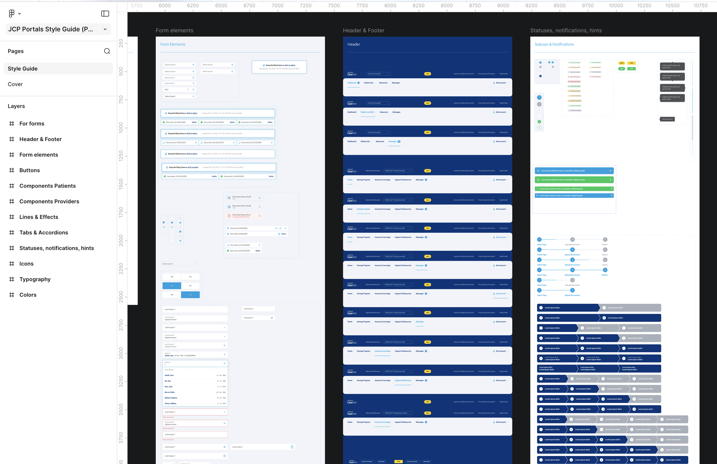
Snapshot of New Style Guide (Design System)
Redesigned Portal Wireframes
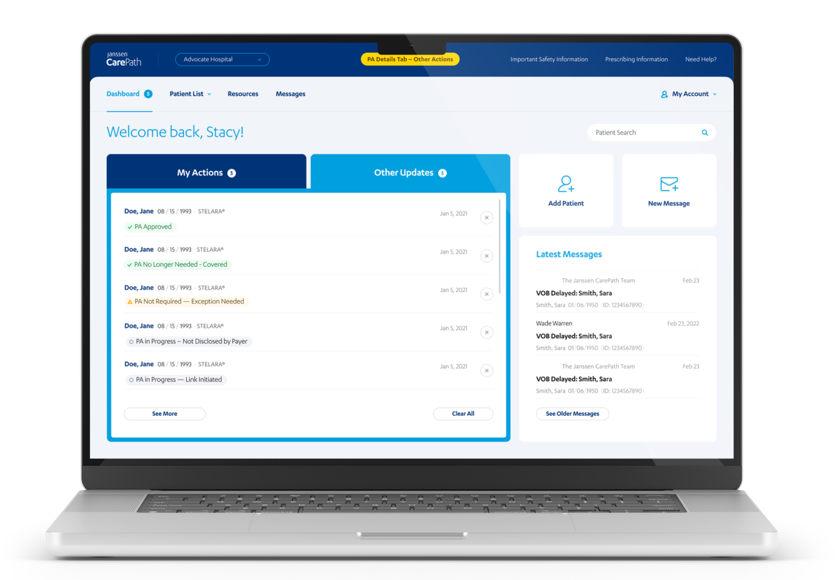
Encoding compliance into components, not adding it as a layer
Rather than treating FDA requirements as a checklist applied after design, I worked with Commercial Advisory Committee (CAC) teams to build disclaimer placements, risk warning hierarchies, and consent capture patterns directly into the component architecture. Pre-approved components could then be reused across brands without triggering redundant review cycles.
Real Impacts
Delivered:
Unified design system supporting 18+ pharmaceutical brand portals under a single component library for the first time
130+ screens delivered across mobile and tablet in 4 phased releases
8 cross-functional work streams coordinated across legal, compliance, regulatory affairs, engineering, and brand teams
WCAG 2.2 AA accessibility standards maintained across all screens
Impacted:
Pre-approved component architecture eliminated redundant FDA compliance review cycles, so that teams could build compliant interfaces without deep regulatory expertise
Established scalable Figma file structure and design system governance adopted across the broader design team
Extended design system to include mobile-specific typography, spacing, and interaction patterns
Figma Prototype Created for eVolve Client Review
What I learned
Janssen CarePath was my first project as a UX designer, and for over two years, it was the environment where I learned what it actually means to own a product.
I joined as the only designer on the team. There was no design lead, no established process, no one to check my decisions against. That forced a kind of ownership I couldn't have developed any other way. I had to learn how to ask the right questions, build trust with engineers and stakeholders from scratch, and make design decisions I could defend without a safety net. Working on the same product for two years also meant I experienced the full cycle of the early ambiguity, the iterative refinements, the moments where something I'd designed months earlier came back as a problem to solve. That long arc taught me things about product thinking that short engagements simply can't.
Partway through, the team grew. A design lead joined, and for the first time I had a mentor, someone who could see my work from the outside and give me a frame of reference I didn't have before. That shift was just as valuable as the solo period. Having someone push back on my decisions, name patterns I hadn't recognized in my own work, and model how to navigate client relationships at a senior level accelerated my growth in ways I hadn't anticipated. I learned that both modes, having the deep ownership of figuring things out yourself, and the perspective that only comes from someone who's been further down the road, matters.
What I carry from this project isn't just the technical knowledge of designing in a regulated environment. It's the understanding of what it feels like to be genuinely responsible for a product, and how that responsibility shapes the way you make every decision, big and small.