
TogetherNow MyWayfinder
Key Words: Public Health UX, Social Care Platform, Design System, End-to-End UX Ownership, Policy Transformation, Accessibility, Figma
When someone needs help, whether it's finding food assistance, affordable childcare, or palliative care for a family member, the hardest part often isn't the need itself. It's knowing where to start. A Google search turns up results from outside the area that may not be up to date. Calling around to families, friends, and churches becomes the default. MyWayfinder was built to fix that, a single, self-directed platform connecting Rochester-area residents to vetted local services. I joined as the sole Senior UX Designer when the platform had no design structure, no guidelines, and a growing mandate from New York State that had to be translated into a working product.
TogetherNow / United Way of Greater Rochester, MyWayfinder, a web-based community resource discovery and social care coordination platform
Client
Two connected phases:
- Platform redesign and design system build
- Expansion to support New York State's Social Care Network (SCN)
Scale
My Role
Senior UX Designer
Tools
Figma
Duration
Oct 2024 - Nov 2025
Real Problem (a.k.a. the challenge)
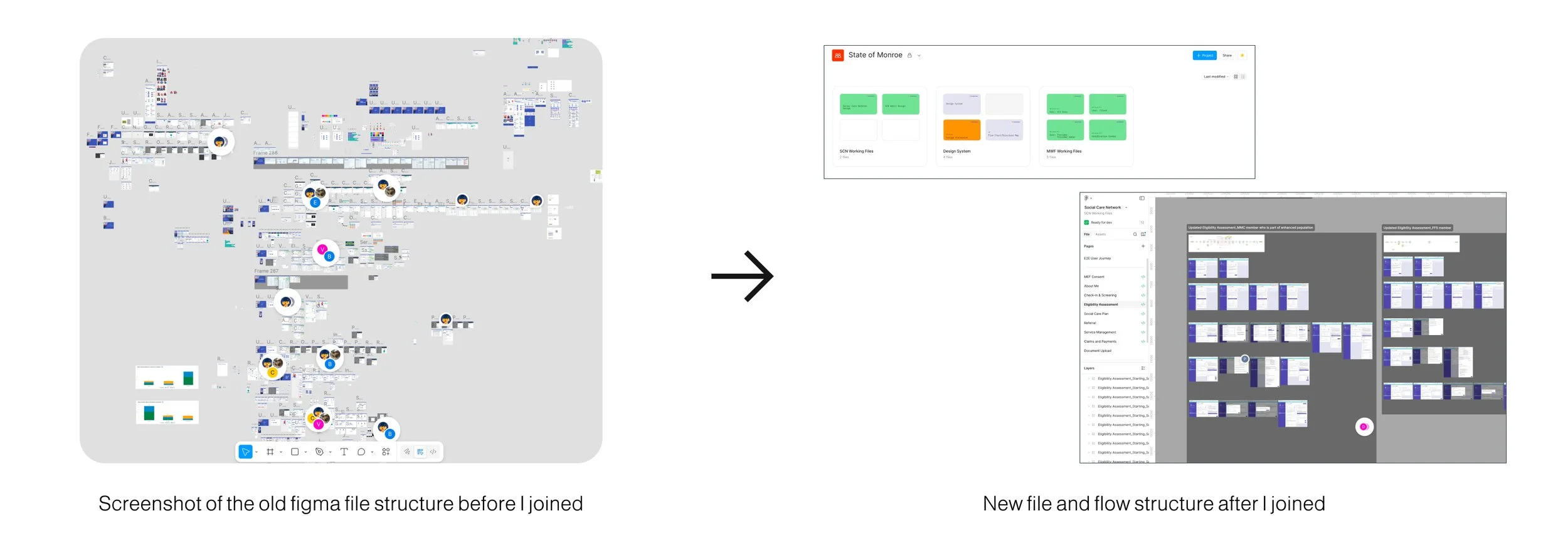
MyWayfinder was meant to be a self-navigated, user-friendly portal for connecting with various providers, but the platform I inherited had been built without a designer. There was no design system, no consistent file structure, no established patterns. Everything lived in a single Figma file with no naming conventions or organization.
Beyond the structural problems, the design challenge was fundamentally about access:
Users ranged from individuals in crisis searching for immediate help, to caseworkers managing referrals for others, to nonprofit partners administering services, all within the same system
Many users had limited digital literacy, relied on shared devices, or were accessing the platform during stressful, high-stakes moments in their lives
The platform needed to feel approachable and trustworthy to someone who had never used it before, while also being efficient for power users like caseworkers who used it daily
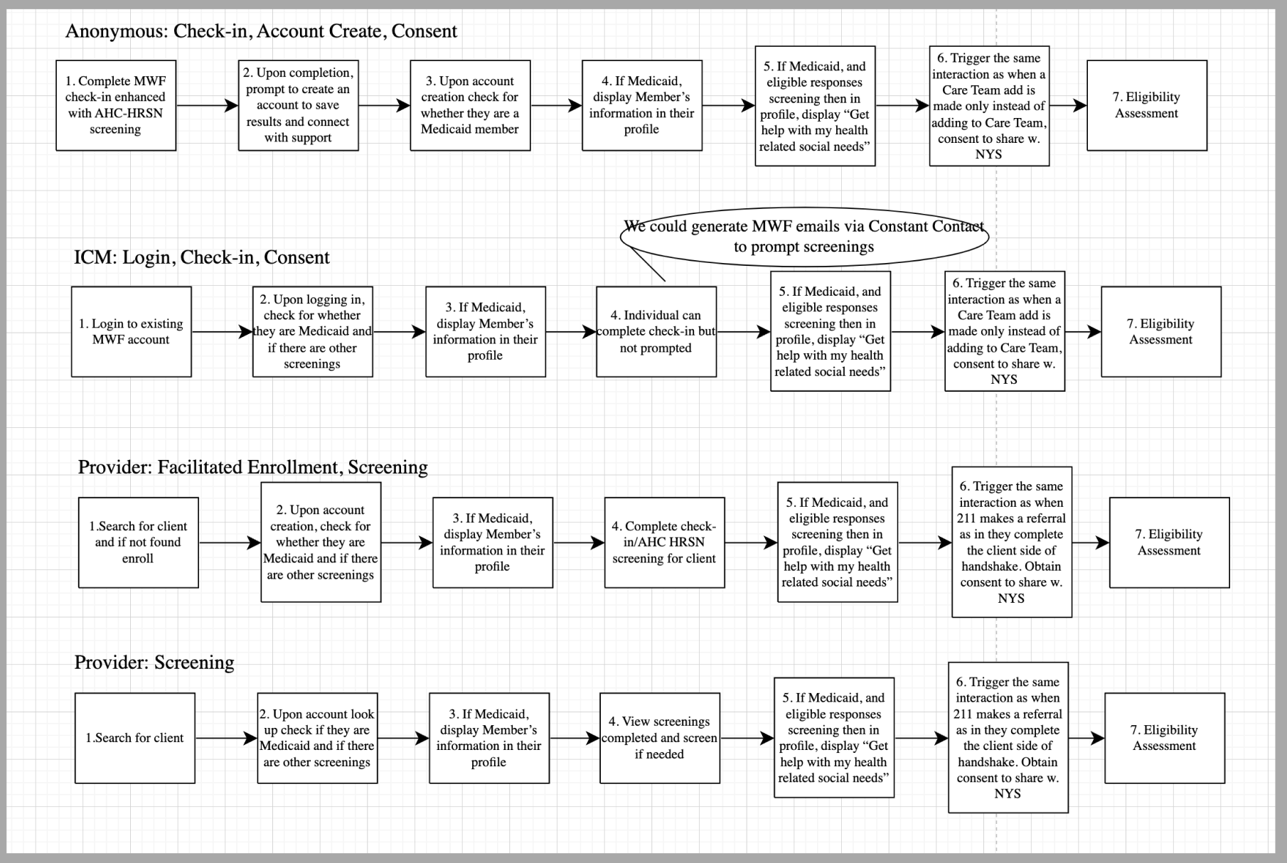
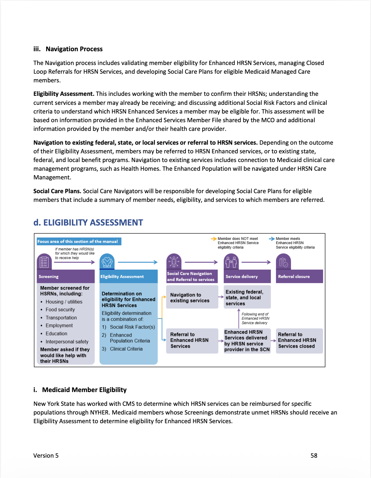
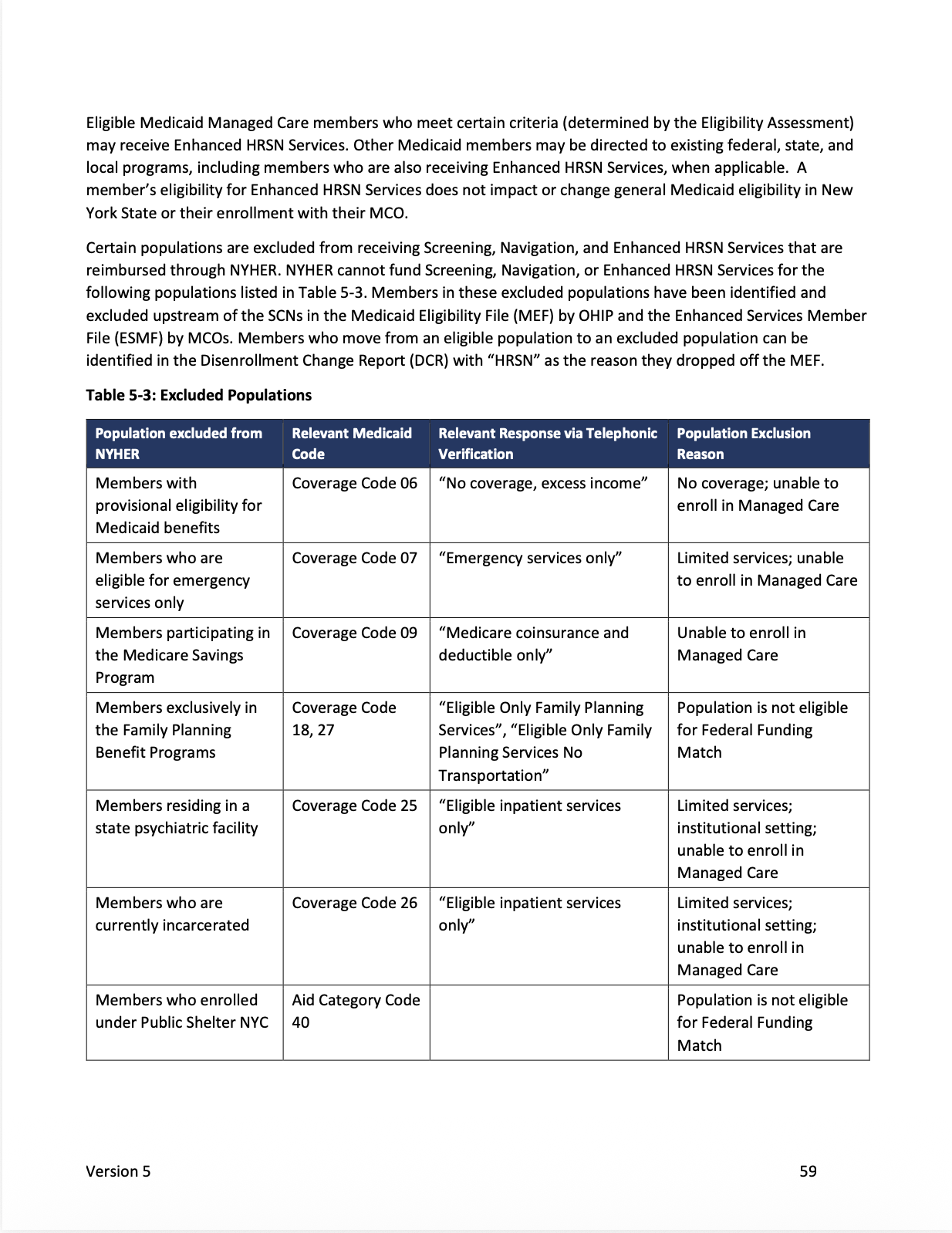
Then came a second, harder challenge. New York State's Social Care Network (SCN), a statewide program coordinating health-related social needs, issued a 200+ page operational manual that had to be integrated into the existing live platform without breaking what was already in use.
Constraints
No design foundation to build on: I joined a team with no prior design structure, meaning everything from file organization to component libraries had to be built from scratch while the product was actively being used
Diverse user population with accessibility needs: Users with varying digital literacy, potential cognitive load under stress, and the need for WCAG-compliant design throughout
Live product, evolving requirements: The SCN expansion required designing entirely new workflows, roles, and system logic, layered on top of an existing product that couldn't be disrupted
Policy-driven complexity: The 300+ page SCN manual contained dense operational requirements that had to be translated into usable flows, with no room to simplify away compliance requirements
Small team, large scope: As the sole designer, I owned everything from research synthesis through production validation
Design Decisions
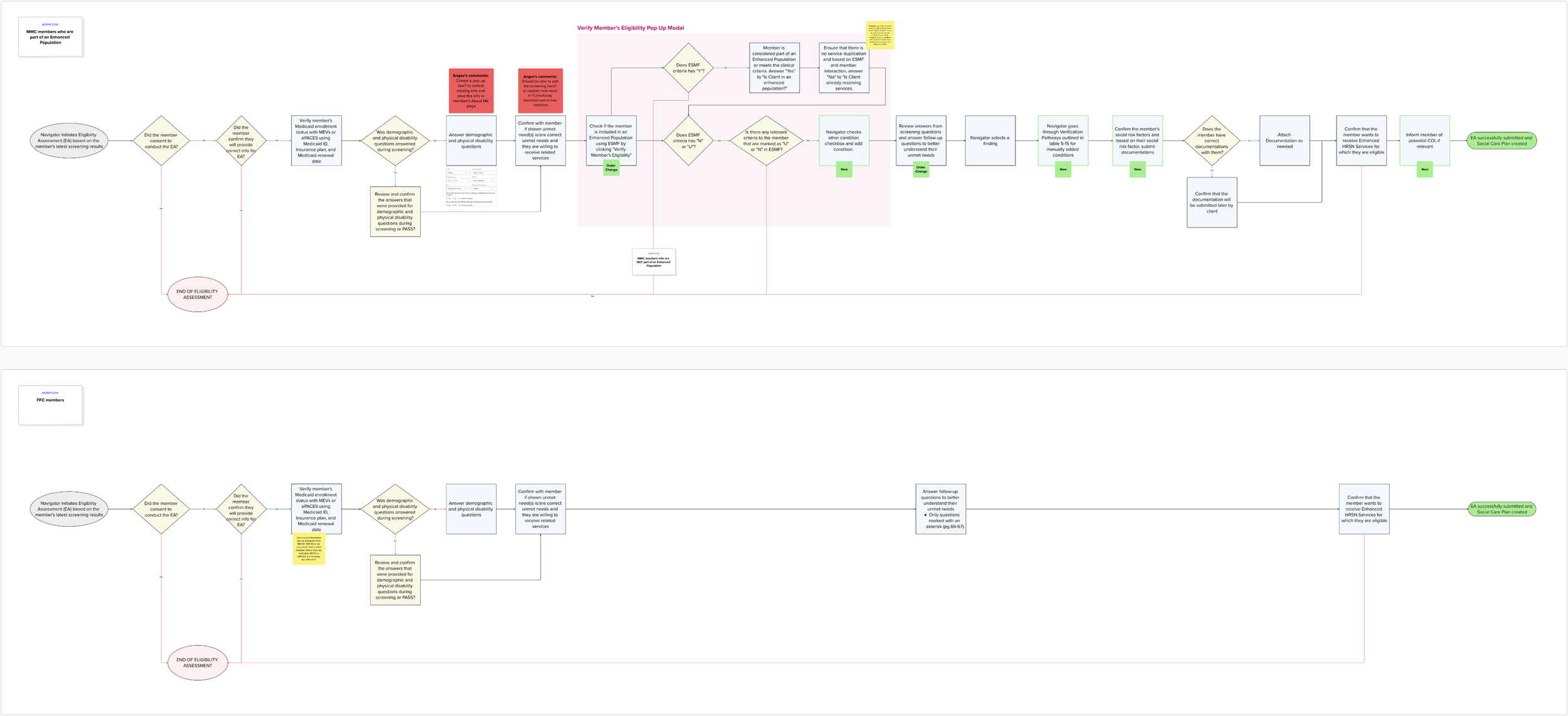
Design system first, screens second
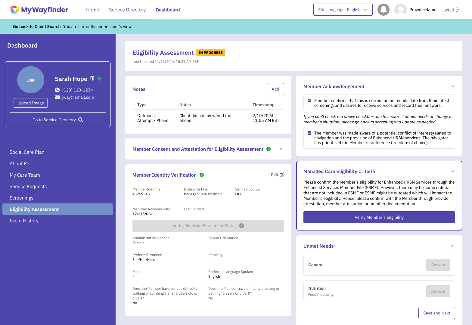
Before designing any new features, I audited everything that existed and rebuilt the Figma workspace from scratch, organizing files by functionality, establishing naming conventions, and creating a reusable component library. This wasn't just housekeeping. Without a shared foundation, every new screen would compound inconsistency. Building the system first made it possible to design at the pace the project required.
Designing for the moment of uncertainty, not the ideal user
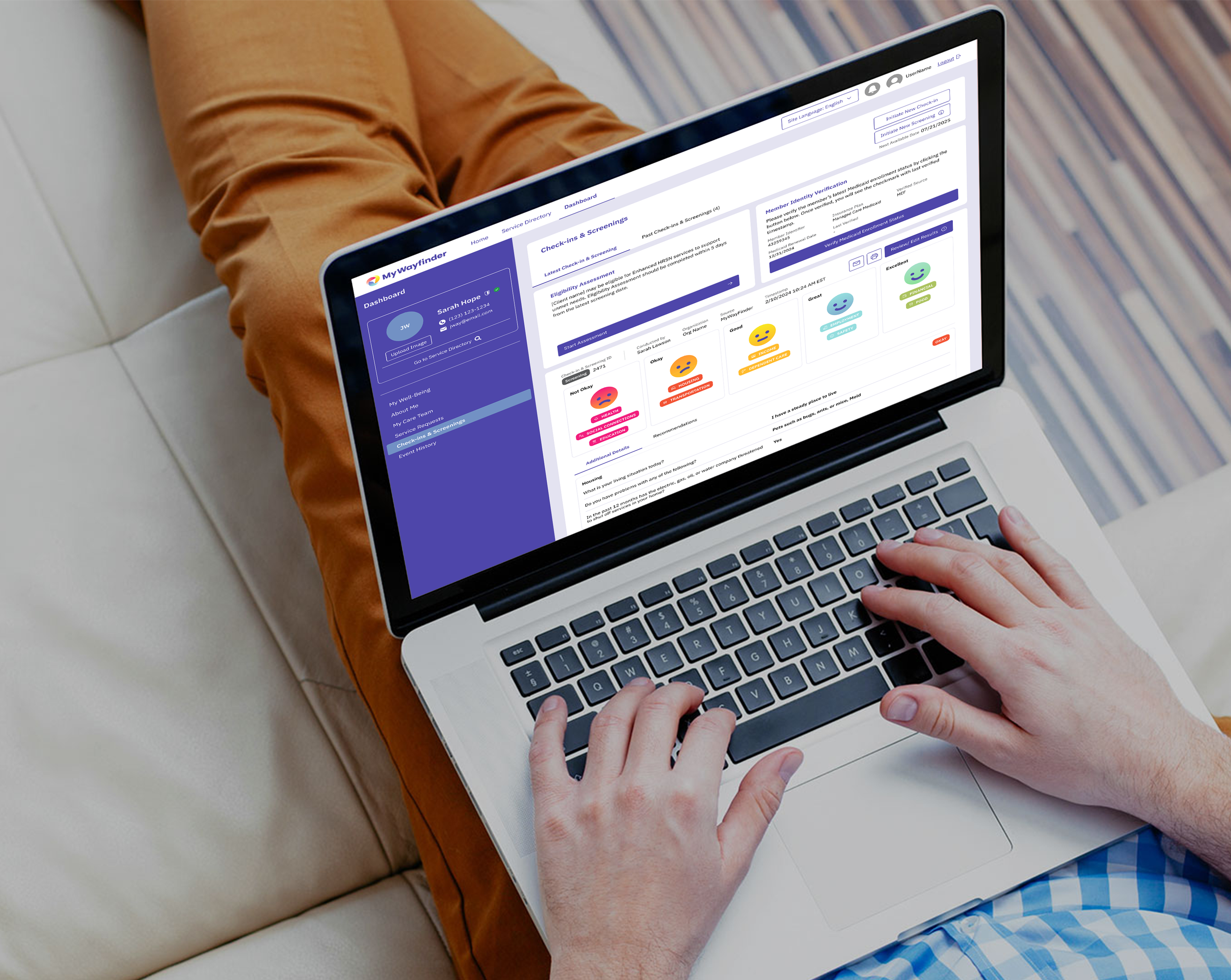
Every person has a moment in their life where they need some support, and that moment rarely comes when someone is calm and tech-savvy. I designed every flow by asking what someone needs to do next when they don't know where to start. That meant conversational language over clinical terminology, progressive disclosure over comprehensive forms, and mobile-first layouts for users who might be accessing the platform from a phone in a difficult moment.
One platform, multiple user types
Rather than designing separate experiences for end users and caseworkers, I designed structured decision flows that adapted based on user input and role, surfacing the right information and actions for each context without requiring separate product tracks. This kept the system maintainable while supporting meaningfully different use cases.
Translating policy into UX, not just UI
For the SCN expansion, the 300+ page state manual wasn't a feature spec. It was a compliance framework that had to become a usable product. I worked closely with United Way stakeholders and engineering to identify overlaps with existing functionality, map new user roles and permissions, and design flexible flows that could accommodate future policy changes without requiring a full redesign.
→
Real Impacts
Verified outcomes (Sources: WXXI News, 13WHAM, August 2025)
Prior to public launch, the platform had already been tested in the community by over 28,000 users who conducted more than 160,000 resource searches
Greece Central School District adopted MyWayfinder as part of its community school model to connect families with needed supports
The platform's public launch was covered by Rochester's Mayor and received coverage across multiple local news outlets
Platform built in partnership with 100+ community partners and serves the Greater Rochester region's full spectrum of social services
Design Impact
Built the entire design system and Figma workspace from scratch, establishing component libraries, file structure, and design processes that scaled across the platform and supported future development
Translated a 200+ page New York State operational manual into a cohesive set of user flows, roles, and system logic within the existing live platform
Delivered end-to-end UX ownership across both phases, from research and strategy through high-fidelity design, developer handoff, and production validation
Client testimonial
"One of the best parts of working together with Patricia has been the design review sessions where we could collaborate and iterate the design together. These conversations would really light me up. I love how Patricia incorporated our branding into the platform and I appreciate the way she has leveled up how it all looks. I'm going to miss working with her." — Angee Brown, Senior Vice President of TogetherNow
I learnt…
This project was the most direct reminder I've had that design decisions have human consequences. The people using MyWayfinder weren't browsing. They were looking for help during some of the hardest moments of their lives. That context shaped every decision, every label, every flow, every piece of feedback text. It made me a more intentional designer.
It also taught me what it means to build something that endures. The platform went through extensive community testing before public launch specifically because it needed to work for someone in a moment of crisis, every time, reliably. That kind of trust isn't designed in a single sprint. It's built through iteration, community input, and a willingness to slow down when the stakes are high.
Building from nothing, no design system, no file structure, no established process, while simultaneously expanding a live product was also the most complete end-to-end ownership I've had on any project. It stretched every part of my skill set at once.