
"Our website was built without a proper designer and need to incorporate new requirements from state. Could you help us out? "
TogetherNow MyWayfinder
Project Overview
TogetherNow MyWayfinder is a web-based platform designed to help individuals and families navigate local community resources more easily. Built in partnership with United Way of Greater Rochester, the platform aims to reduce friction in accessing essential services (housing, food assistance, childcare, healthcare, and more…) by guiding users through personalized pathways based on their needs.
About the Client
United Way of Greater Rochester is a non profit organization focused on improving lives by mobilizing community resources and partnerships. As part of their broader TogetherNow initiative, MyWayfinder was created to address systemic challenges in how people discover and access social services.
Accessing social services is often complex, fragmented, and overwhelming, especially for individuals navigating multiple needs at once.
Key challenges included:
Lack of an established design structure, guidelines, or processes within the team.
Users with varying levels of digital literacy
The need to support caseworkers, nonprofit partners, and end users within a single system
Ensuring accessibility and clarity
The goal was not just to design a usable interface, but to create a system that could guide users through uncertainty.
The Challenge
My official role was senior UX designer, with end-to-end ownership. I led UX design across the full lifecycle of the project, including:
Research synthesis and problem framing
UX strategy and information architecture
High-fidelity design and interaction patterns
Cross-functional collaboration with product, engineering, and stakeholders
Design documentation and developer handoff through production validation
I worked closely with United Way stakeholders to balance user needs, operational constraints, and long-term scalability.
My Role
MyWayfinder was designed with digital equity at its core. Many users accessing this platform may rely on shared devices, have limited internet access, or feel intimidated by complex systems.
Design priorities included:
Clear, conversational language
Mobile-friendly layouts and accessible interaction patterns
WCAG-informed design decisions to support inclusive access
Every design choice was evaluated through the lens of “Does this make it easier for someone to take their next step?”
Design Approach
Designing for Digital Equity
The platform supports a wide range of user journeys, from individuals seeking immediate help to service workers supporting others. To manage this complexity, I took following approaches:
Designed structured decision flows that adapt based on user input
Created reusable patterns to support consistency across services (Built new design workplace with new design system)
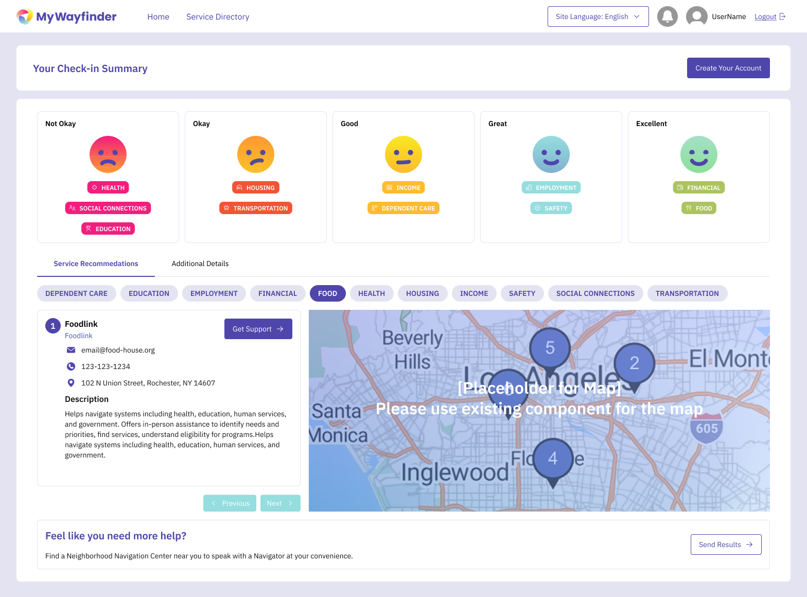
Simplified dense information into scannable, task-focused layouts
Structuring Complexity into Clear Pathways
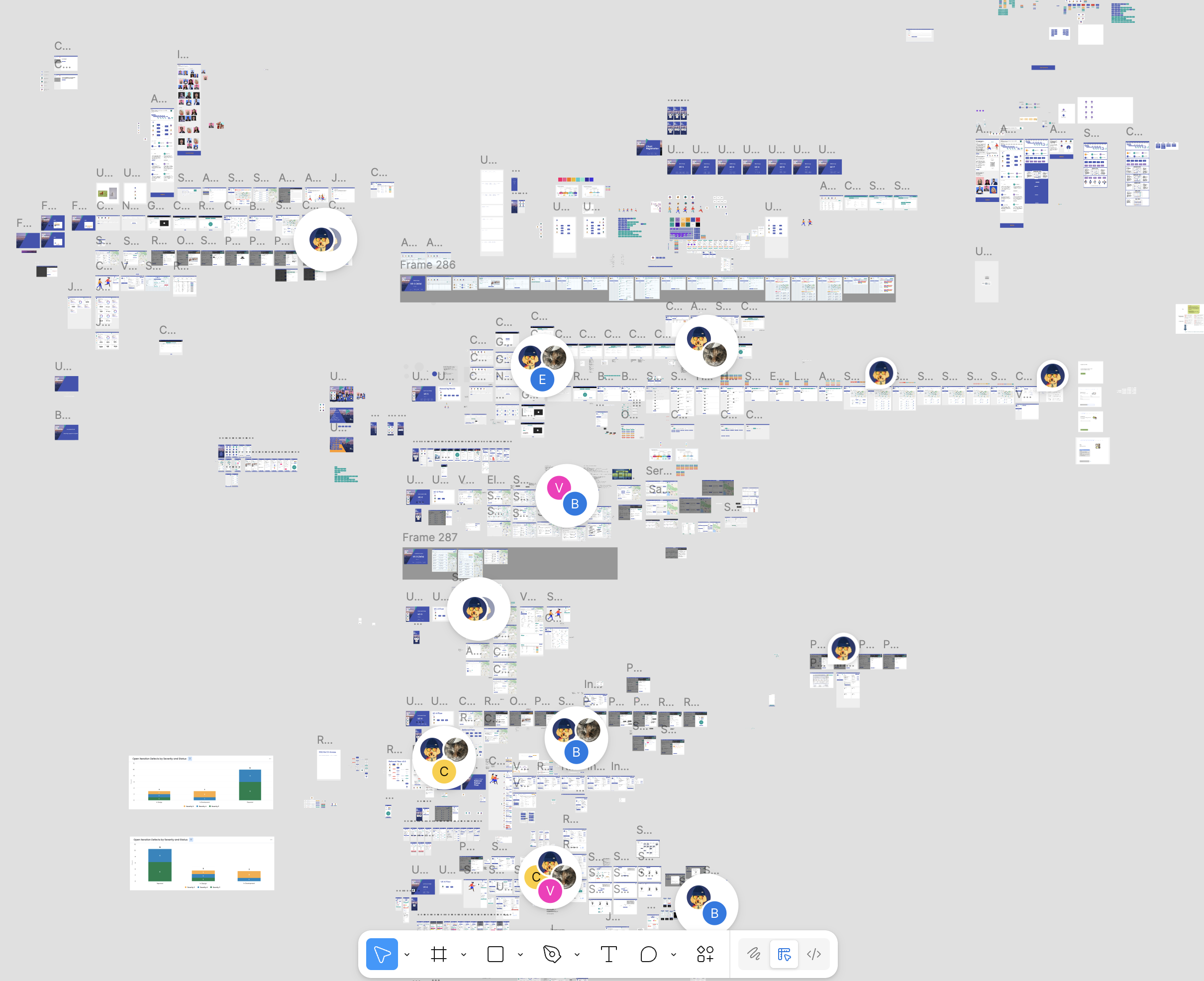
Screenshot of the original Figma workplace before I joined. Everything was stored in a single file structure without clear naming conventions or proper organization.
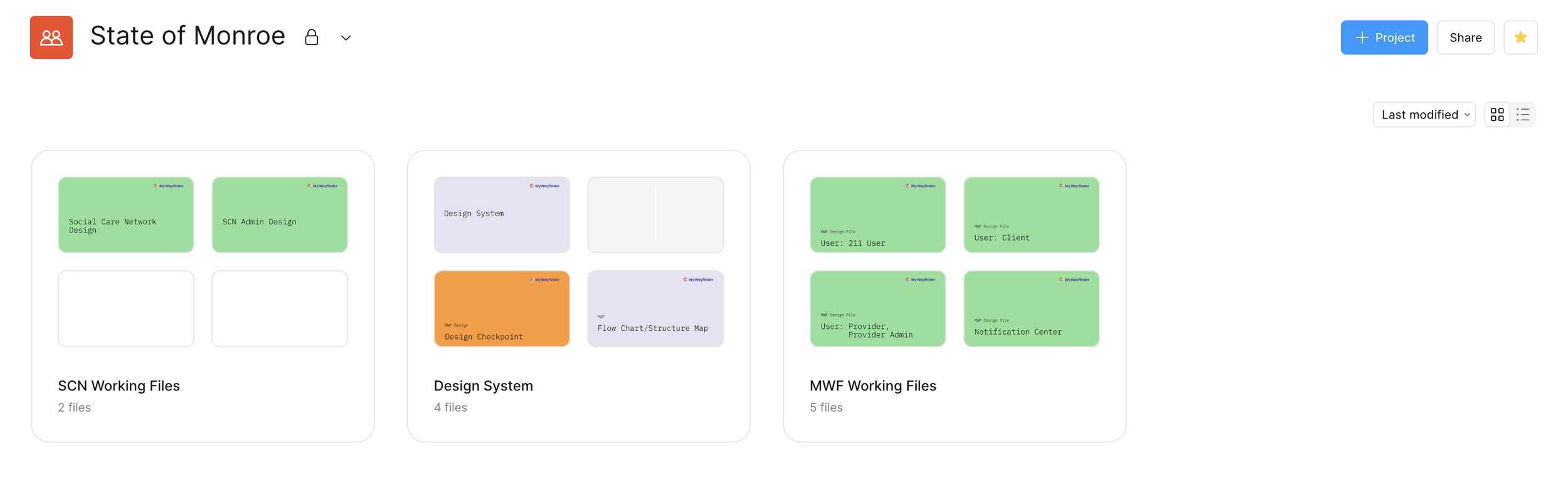
After reviewing all screens and user flows, a new Figma workspace was created with an organized file structure based on functionality, along with proper grouping within each file.
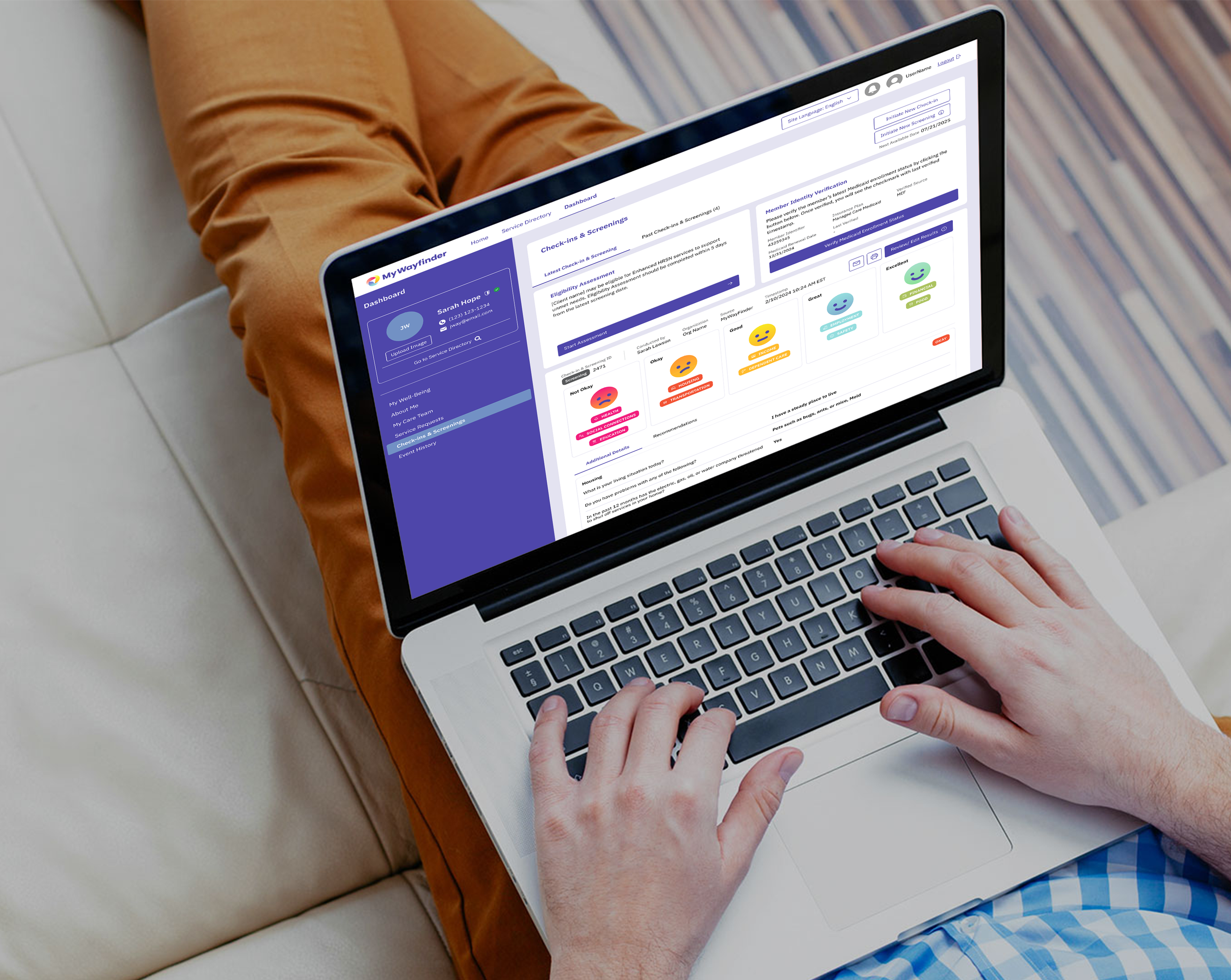
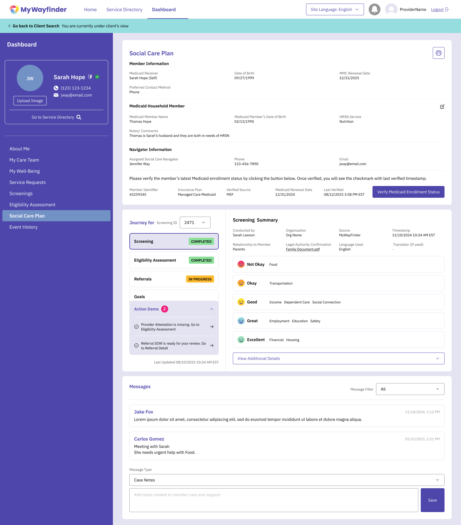
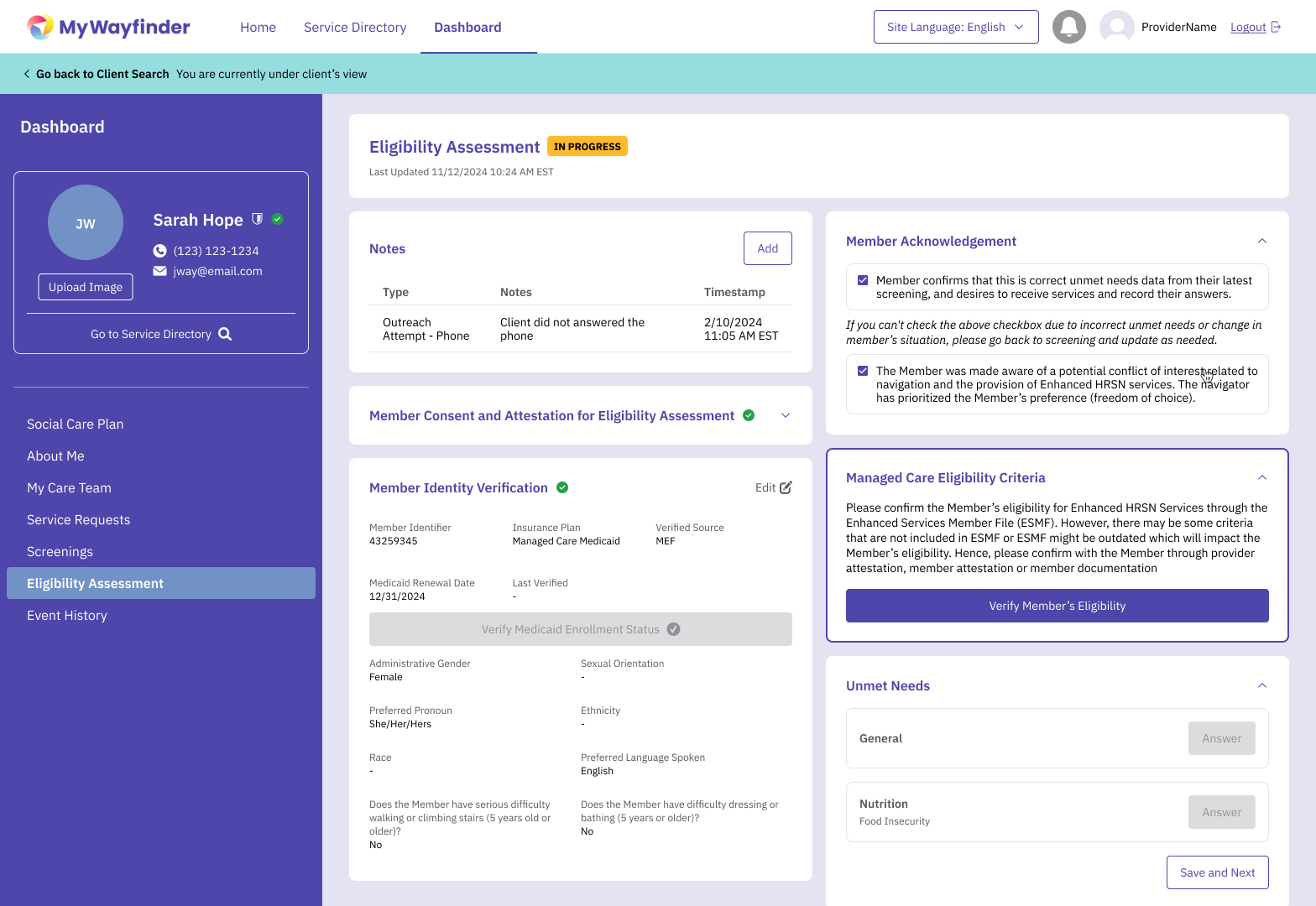
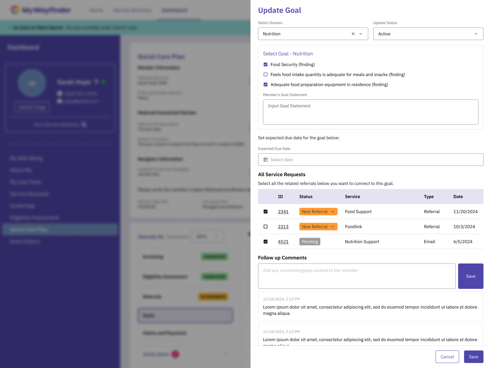
As part of the MyWayfinder initiative, the platform was expanded to support New York State’s Social Care Network, which is a statewide program designed to coordinate health-related social needs across community organizations.
This phase of the project introduced a significant new challenge, integrating a 200+ page operation manual issued by the state into an existing digital product that was already in use.
Rather than building a separate system, the goal was to evolve the existing MyWayfinder platform, while simultaneously preserving existing design and designing entirely new workflows, roles, and system logic to support SCN requirements.
Expanding the Platform for Social Care Network (SCN)
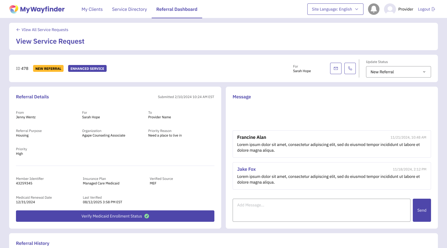
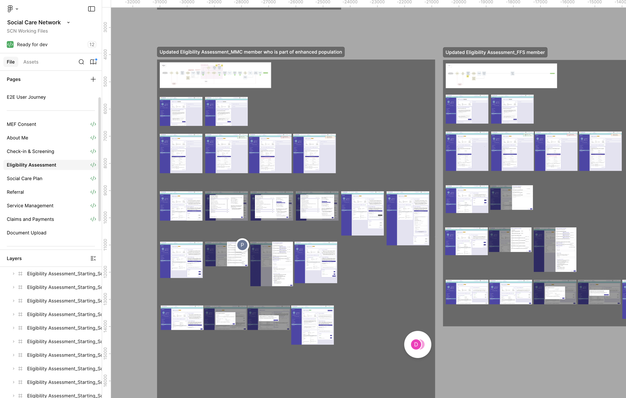
Some screenshots of SCN wireframes
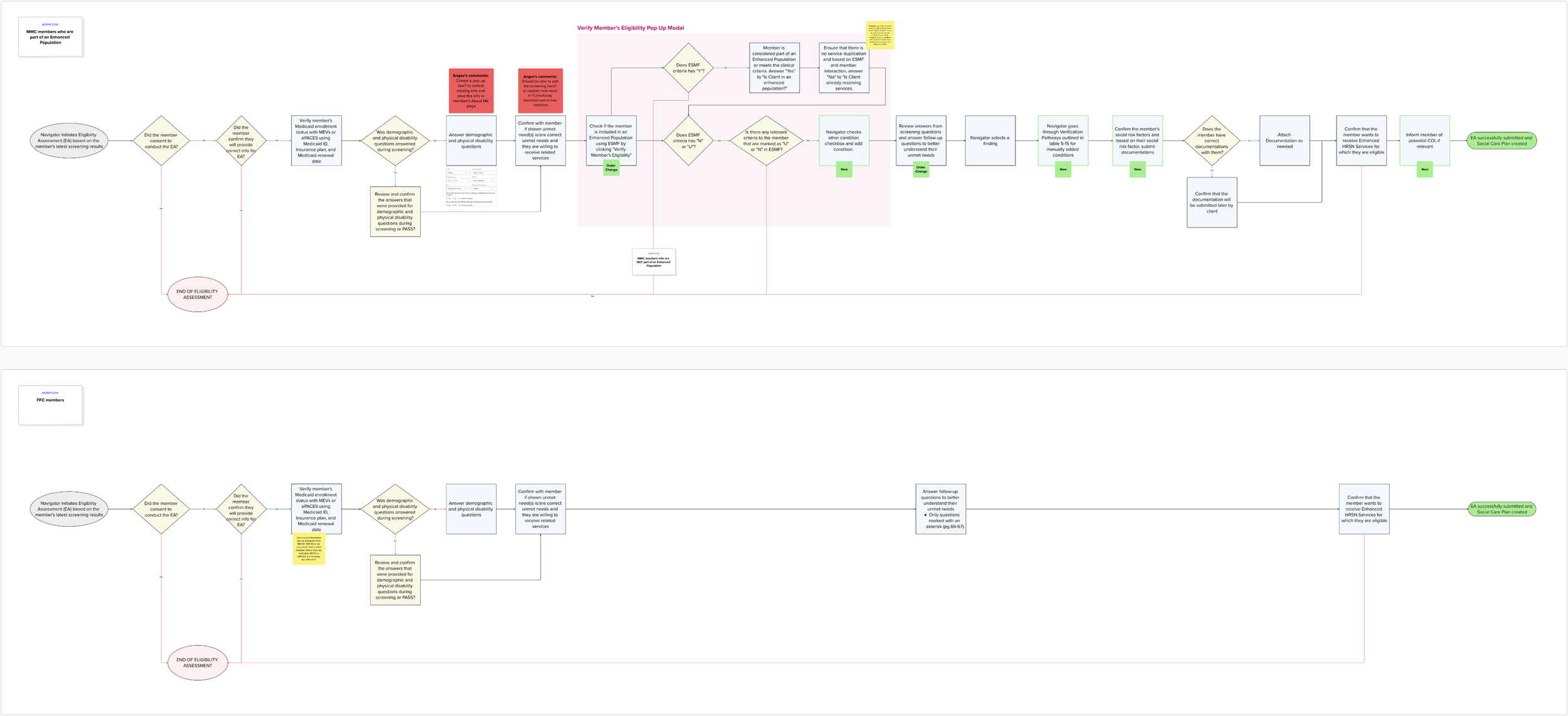
User Flow for Eligibility Assessment
As the Senior UX Designer, I led the UX effort to translate the SCN operational framework into a cohesive digital experience.
Synthesizing complex policy documentation into clear user journeys and system workflows
Identifying overlaps and gaps between existing MyWayfinder functionality and new requirements
Collaborate closely with product, engineering, and United Way stakeholders to validate feasibility
Design flexible flows that could adopt future policy or operational changes
My Role in the SCN Expansion
A successfully evolved MyWayfinder platform that supports state-level social care coordination
A scalable UX foundation capable of supporting future SCN phases and requirements
Clear and usable workflows derived from dense policy documentation
By translating a 200+ page operation manual into a functional, human-centered system, the platform now serves as a critical digital infrastructure supporting New York State’s social care ecosystem.
Some press about our outcome ᵕ̈
https://www.rochesterfirst.com/news/local-news/mywayfinder-rochesters-hub-for-social-services/
https://www.wxxinews.org/local-news/2025-08-14/tool-aims-to-make-it-easier-for-people-to-find-help-and-services-in-the-rochester-area
https://13wham.com/news/local/innovative-platform-mywayfinder-connects-families-to-vital-resources
Outcome & Impact
“One of the best parts of working together with Patricia has been the design review sessions where we could collaborate and iterate the design together. These conversations would really light me up. I love how Patricia incorporated our branding into the platform and I appreciate the way she has leveled up how it all looks. I’m going to miss working with her.”
— Angee Brown, Senior Vice President of TogetherNow