
CAMMIS DHCS
Key Words: Government Healthcare, Public Sector, HIPAA Compliance, WCAG Accessibility, Agile, Design System, Transactional Workflow Design, Saas Migration, Figma
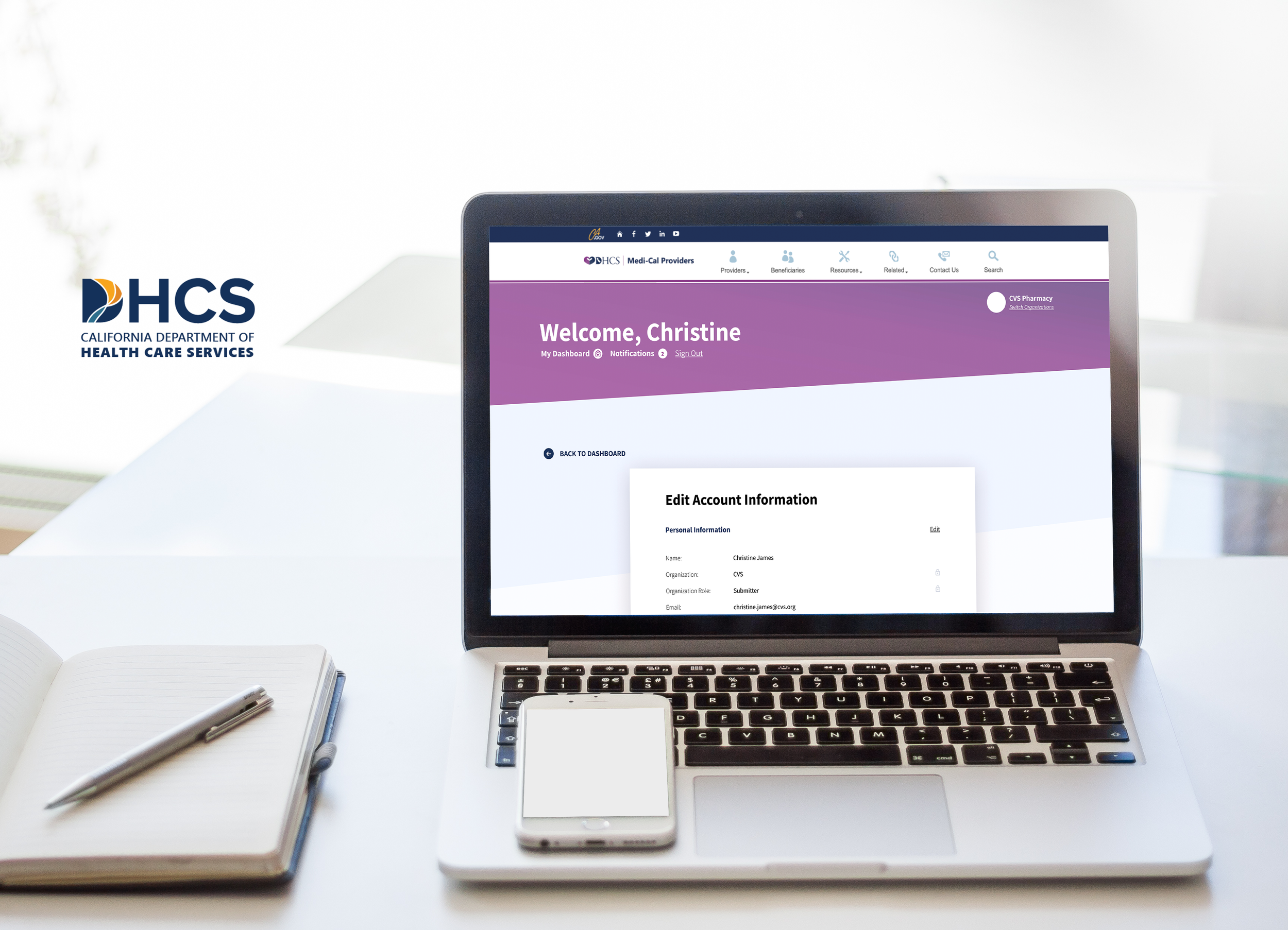
California's Medi-Cal platform serves millions of residents statewide, but the provider-facing system had grown into a fragmented collection of legacy applications, each with its own logic, layout, and interaction patterns. Providers navigating daily transactions had to context-switch between inconsistent interfaces to complete the same core tasks. The modernization effort wasn't just a migration. It was a chance to bring coherence to a system that millions of people depended on, without disrupting what was already in production.
California Department of Health Care Services (DHCS) CAMMIS, Medi-Cal's provider portal supporting eligibility, enrollment, benefits, and transactional services
Client
Legacy-to-SaaS migration of transactional services into the unified provider portal, across 100+ screens
Scope
My Role
UX Designer across 3 squads
Tools
Figma, ServiceNow
A core IBM design team of 5 (1 Design Lead and 4 designers including myself).
Team
Squad 2 (Provider Portal), Squad 7 (Presumptive Eligibility) and Squad 11(DETEC)
Squads
Duration
Apr 2023 - Mar 2024
Real Problem (a.k.a. the challenge)
CAMMIS had accumulated years of fragmented development across separate legacy applications. By the time modernization began, providers using the platform daily encountered:
Different layouts, terminology, and interaction patterns depending on which transactional service they were accessing, even for functionally similar tasks
No standardized error handling or system feedback, leaving providers uncertain when something went wrong mid-transaction
Transactional services spread across disconnected entry points, requiring providers to navigate out of the main portal to complete common tasks
No shared component foundation, meaning each new screen was designed and built from scratch, which eventually leading to create inconsistency and slowing delivery across squads
The goal was to consolidate these services into a single, coherent portal experience, without breaking the workflows providers relied on every day.
Regulatory: State and federal compliance requirements governed transactional data handling, eligibility logic, and audit trails throughout
System integrity: The existing CAMMIS platform was in active daily use, so designs had to accommodate phased releases without disrupting live workflows
Scale: 100+ transactional screens across multiple functional areas, delivered across phased releases with multiple squads working in parallel
Cross-squad consistency: Three squads working on different functional areas had to produce interfaces that felt like one cohesive system, requiring constant coordination on shared patterns
Accessibility: WCAG compliance was required across all screens serving a diverse provider population
Constraints
Design Decisions
Pattern-first before screen-by-screen design
With 100+ screens across three squads, designing each screen independently would have produced the same fragmentation we were trying to fix. Instead, I pushed to establish shared transaction templates and interaction patterns first, which helped standardizing how errors surfaced, how multi-step flows progressed, and how status changes were communicated. This meant slower starts but significantly more consistent output at scale.
Designing for the edge case, not just the happy path
Transactional workflows in a government healthcare platform have high stakes, such as, a provider submitting eligibility data incorrectly can have downstream consequences for a patient's coverage. I prioritized designing explicit error states, validation feedback, and confirmation patterns for every transaction flow, not just the primary path. This added design scope upfront but reduced the ambiguity handed off to engineering.
Snapshot of New Style Guide (Design System)
Staying embedded through handoff and QA
On a project this size with multiple squads, design handoff is where consistency breaks down. I stayed involved through developer handoff and iterative delivery, catching implementation drift early and maintaining alignment between design intent and what shipped.
Real Impacts
Scale
Platform serving ~15 million Medi-Cal beneficiaries and processing ~200 million claims annually (the largest Medicaid population in the nation)
100+ transactional screens redesigned and migrated into the unified provider portal
3 squads coordinated across Provider Portal and Presumptive Eligibility workstreams
Outcomes (Source: IBM Case Study)
96.7% of Medi-Cal user volume successfully migrated to cloud
30% reduction in delivery cost since the start of the cloud migration journey
3,100+ providers adopted fully paperless processes when it previously was mainly paper-based workflows
PIN reset time reduced from 30 days to real-time processing
30,000+ providers onboarded to the modernized portal
Average of 2+ features shipped per week throughout the program
Design Impact
Standardized interaction patterns and component library across multiple squads, enabling consistent delivery at this pace and scale
WCAG accessibility standards maintained across all transactional screens
I learnt…
This was my first experience working in a fully agile, squad-based environment and it reshaped how I think about design at scale.
What made this project particularly formative was that I was part of the design team from day one through final delivery. The weekly design syncs we held became the backbone of how the team stayed aligned across squads, and learning how to make those sessions actually useful rather than just routine check-ins was its own skill to develop.
Our design lead was also navigating his first time leading a team of this size, which meant the structure wasn't always perfect. Not everything went smoothly, and that was honest and instructive. It taught me that good design leadership isn't about having all the answers. It's about creating enough shared context that the team can make consistent decisions independently. The times we struggled were usually when that shared context broke down. The times we succeeded were when the design system did the talking for us, when a designer on a different squad could look at a component and know exactly how to use it without needing to ask.
Being the only designer embedded in each of my squads also meant I was the sole representative of the design perspective in rooms full of engineers, PMs, and business stakeholders. There were moments where I had to advocate for a design decision against pushback, negotiate with engineering on what was feasible without compromising the user experience, and explain design rationale to people who hadn't been part of the process. That experience built a confidence in articulating design decisions that I don't think I could have developed any other way.
Working across 3 squads simultaneously also sharpened how I think about what to standardize and what to leave flexible. Early on, I over-standardized, trying to lock down too many patterns before we fully understood the edge cases each squad needed to handle. What I learned over time was to build foundations that were opinionated enough to create consistency but flexible enough to accommodate real variation. And the pattern-first approach, which felt like overhead at the beginning, became the thing that made parallel delivery possible. By the time we were deep into delivery, I could hand a pattern to another squad and trust they would apply it consistently without a lengthy explanation. That was the moment I understood what a design system is actually for.